Sofia's AICE Media Year
Wednesday, April 9, 2025
Final Project!
Final Feelings...
RESOLUTION
- Try something different/Don't be afraid when something different comes at you:
- Just Do It.
- Finally, what is your intention as a filmmaker?
- You got to fight for what ya want!!
Tuesday, April 8, 2025
Final CCR
The six-episode documentary series Intertwined takes a sociological approach to the Western world's current state of connection. Recognizing how part of today's society feels disconnected, Intertwined aims to shine a light on the other side of the story, the present communities and chances for connection that truly are all around. Intertwined takes a hopeful approach to how communities are interacting and what connection means, specifically in some of South Florida's distinct communities. By displaying the individual differences between those in each group, Intertwined ultimately shows how the universal yearning for connection and love binds us all.
Each episode focuses on some of the many ways through which people come together: hobbies, volunteer work, jobs, passion projects, etc.. Focusing on the first episode, we interviewed Las Gaviotas, an RC pilot group that meets at Markham Park, Sunrise.
Because Intertwined is a sociological documentary on communities in South Florida, research conducted began with exploring lesser-known but active subcultures across South Florida.Research consisted of online research in social media, word-of-mouth, and in-person discussions with their teacher. With all of this, plus familiarity of their own local communities, Victoria and Sofia Di Lauro were able to find five niche groups, one including the remote control (RC) airplane community that meets weekly at Markham Park. Learning about their long-standing rituals and the diversity of the group led to the focus on this unique slice of communal life. Traditional documentary conventions were followed, such as interviews, on-location shooting and B-roll use. Specific to the sociological aspect, conventions such as interviewing an expert (psychotherapist) for the social media and using observational footage of humans in real time were followed. On the other hand, other genre expectations were challenged by spotlighting a hobby not typically considered “sociologically significant”—and revealing the deep human connections behind it. Focusing on this group showed that even niche communities can reflect themes and ideas like identity, belonging, and passion, bringing bonding.

The episode uses personal stories, visual storytelling, and diversity amongst groups to connect to the target audience, 13-85 year olds of any gender and socioeconomic status. Intertwined, focusing on a variety of communities with different backgrounds and passions/activities, makes it easier to attract and preserve a broad range of audiences, the target audience. In addition, representing different things like a hobby/job/volunteer work/etc... on the social media page and documentary invites viewers into a world they already know (audiences can relate to the content) or into a world they don't know (in which they will be intrigued to learn about different parts of a community). Including personal interviews of varying community members on the documentary, spanning from different ages, cultural backgrounds, and professions, adds relatability and emotional pull to the episode.This documentary series centering around fundamental human aspects (connection and various forms of community involvement) makes it so that practically anyone can already feel some relatability and attraction to the product.
Through the beginning of the documentary's first episode, documenting the RC (remote control) pilot group attracts the target audience's age range. Younger audiences can relate to themes of passion and finding community through hobbies, while older viewers may connect with the nostalgia and craftsmanship involved. While this attracts the target audience, the use of social media was the key to direct engagement. While many posts were used to introduce the communities and define connection/community, they also had a just as important goal: to engage with the target audience. Taking inspiration from the Netflix documentary's Abstract social media page, many of the Intertwined Instagram posts include a caption that asks questions directly to the audience. Using pronouns like "you" and asking questions relating to the audience's personal lives creates an intimate connection to the audience that can't be done from only watching the documentary.
Abstract Instagram Captions:
Intertwined Instagram Captions:
To start off, including animation as the main source as branding makes the documentary recognizable and more attention-grabbing. The unique animation sequence is not only used as the docuseries's opening sequence, but is seen as a consistent element in the social media page and magazine article for Intertwined. Using animation assists in making the docuseries feel more approachable and lighthearted, connecting younger audiences to "bigger ideas" such as connection and community. This, along with the copyright-free song "Peace" by Roie Shpigler, which is paired in the opening sequence and several Instagram posts, creates distinctiveness to other docuseries. Distinctiveness and being memorable to the audience so Intertwined attracts more attention in an increasingly competitive environment with online advertising/marketing.
Although Intertwined manages to resonate emotionally with all types of audiences, visual and auditory techniques targeting older audiences could've been improved. In the documentary, choices such as including soothing features instead of loud, abrupt noises or utilizing slower pacing consistently would've targetted older audiences more.
Animation in magazine:
Animation seen to represent different communities:
Animation/title in first posts/ introduction to the series on social media page:

This documentary delves deeply into the representation of diverse communities in South Florida in order to highlight the various ways connection takes place. This documentary is partially different from other media products because it focuses on the diversity of social groups, centralizing representation to not just one main group but several. One way in which the differences in social groups are emphasized is through their representation through animation and symbols. The five groups are each represented with their own title for the group, colors, wardrobe, and symbols associated with their "activity". For example, in the RC pilot group, the community is titled "Las Gaviotas" and the animated men wear shades of yellow, grey, and dark blue. The backdrop is dark blue, and they are always associated with an animated yellow plane.
Focusing on this group, which is the docuseries' first episode, the representation of collaboration within a diverse social group is shown. The three interviewees come from very different walks of life, but all find common ground at the same field every Thursday. By avoiding focusing on conflict or controversy, this episode was able to emphasize unity through shared experience. A positive, often-overlooked narrative was represented about how a community can form organically in public spaces. This challenges the notion that people are becoming increasingly isolated and instead celebrates the quiet, consistent acts of connection that happen all around.
Sunday, April 6, 2025
CCR
CCR...
As this is my last blog post on here talking about the CCR,
I should probably start by saying that this is really sad that this is my last blog post like this. I am still processing how this is the end of the process and it feels NOT REAL, but it is so I am trying to soak it all in, letter by letter 😍😍 .
As for the CCR, I have started to write it and have actually started in a different order of questions. As for the practice CCR we did in the beginning of the year, the order consisted of:
1) How did research inform your product and the way it uses or challenges conventions? followed by..
2) How does your product engage with audiences?
I personally actually am answering the second one first. I will see when I end up putting it all together if I keep the answer in that order too, or if I do it how I am writing it.
But overall, the CCR is going pretty good, I am more focused on finishing editing which has been good but A LOt!
Here is a sneak peek of a mini sneak peek I made for the hypothetical fifth episode of our series, titled "The Regulars" (about a home-run "jazz club/card game center"), inspired by my grandpa's card club he partakes in Argentina:It is very film noir inspired in the video that is why there is a smoke picture here
Thursday, April 3, 2025
MUSIC
Live in real time:
NOTES-
How are we trying to make them feel?
Trying to figure out how to balance liveliness and sentimentality
- Nostalgic, "deep" not lightweight topic, somewhat sentimental (because this emotion is one that truly hits people and they are most taken aback by it, not as used to it)
- While also attending to fun, lively, "imperfect" approach of two 18 year old girls. Want the audience to have fun while watching
Structurely:
45 seconds of introduction (more chaotic, lively)--- Interview of us for 30 sec-1 mn (breath of fresh air, more serious but hopeful STRINGS)---leads to animation introduction 30 sec (hopeful, sentimental)-- intro of place/hobbies 30/45 sec (more fun now)-- interviews 2 mn 30 sec
Hey guys! this is me after I was trying to find music (or after the "Live in real time" intervention when I was taking notes and trying to structure my intention with the music)
MUSIC FOR ANIMATION SEQUENCE:
I was specifically trying to find music for the animation sequence, and I am was using Artlist.IO, here are some songs I found:
Peace - Roie Shpigler
Ballerina- Yehezkel Raz
Lev 1- DaniHaDani
We were very convinced on sticking with Ballerina (song below) because of a couple of things.
Tuesday, April 1, 2025
Social Media!
Social Media
Sunday, March 30, 2025
CCR pt. 2...
CCR PLANNING
Lets move on from the social media/filming part of the project and move on to the ESSAY PART!
CCR: Regarding the CCR, it is influential to look at my previous CCR to see what I did good or could maybe work on.
Previously I had made a CCR on a documentary! So it will prove to be more compatible with what I am making now, as compared to a CCR on a short film. Here is the CCR from a couple months back:
Things that appeared good! 👍
- Multimedia Use: I remember a big emphasis on multimedia when my teacher was explaining what to include. Using not only things like videos, audios and pictures, but also using specific media that supports and reinforces what one is saying is significant.
- Directly answering questions: I think while length of the paragraphs and essay is important (especially because of the 1,000 word count), focusing on answering the questions directly is just as, maybe even more, important. In this practice CCR we only had to answer three questions as opposed to four, but answering the 4 questions must be the FOCUS!! Making sure to hit specific things like discussing genre and conventions in the first question and mentioning target audience of the docuseries in the second question is essential.
- Transitioning: I know this isn't an English class but transition words and transitioning between questions smoothly is important.
- Insightfulness/depth of info. I think that spending more time on the CCR is important so I am able to elaborate on information in depth as much as possible.
Friday, March 28, 2025
Animation!
ANIMATION Opening Sequence:
SHE SAID YES!
Thursday, March 27, 2025
Structure for 5 mns
STRUCTURE. STRUCTURE!
STRUCTURE!.. StRuCtUrE.
ROADTRIP
Saturday, March 22, 2025
Pilot Interview 2
Pilot #2 Filming:
Problems/Solutions:
Friday, March 21, 2025
CCR PLANNING
FIRST CCR POST:
Monday, March 17, 2025
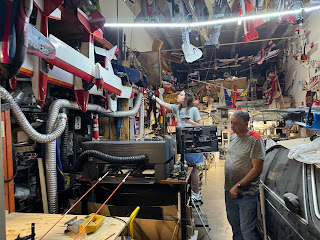
Shooting Pilot Interviews:
Shooting Another Interview! #2
INTERMISSION.
Overall:
Final Project!
Final Project! Hey blog readers. It is time. The project is finally done. This has been a heck of a journey but it has been an extremely r...

-
Transitioning Into Cambridge Portfolio Project! Hello Cambridge peopleeee! From this moment forward, my pos...
-
For the initiation of this course, we were given a more unorthodox formatted quiz. The quiz was a camera shots quiz based on what we ...
-
Creative Critical Reflection: The six-episode documentary series Intertwined takes a sociological approach to the Western world's cu...


